3 Rules Every Website Should Follow
Websites are like art: everybody will have a different vision of what is 'perfect'. But regardless of aesthetic differences, here are 3 things every website should have (and why many website designers fall short).
Michele Li-Fay
3/3/20257 min read
Nowadays, it feels like everybody is a website designer. Thanks to website builders like Hostinger, Wix and so on, you no longer need to know code to be able to build a website. In addition, the explosion of AI has enabled so many people to create code and learn how to make a website.
Don't get us wrong: we love to encourage small business owners to build their own websites for this exact reason. It's much easier than before, it's relatively cheap, and it is a vital part of your brand's digital marketing. It's also the best way to learn, and to overcome any digital jitters you may have.
But we also know building a website can be intimidating if you don't know where to start, and it is also a time-consuming process that many small business owners simply cannot find the time to do. So we will never begrudge a small business owner for finding a website designer to build a website for them. After all, that is a big part of our business.
Many of our clients come to us because they are dissatisfied with their previous website designers' work, and, after reviewing their site, we often come away disheartened and often furious at the previous company's efforts. Because it is very clear that while anybody can declare themselves a website designer, not everybody understands what makes a good website designer, and what makes good website design in the first place.
So if you're wondering why Mpowering Solutions is worthy of your trust, or if you want to understand the true fundamentals of good website user experience, read on to understand our website design ethos and values, and see if they align with your vision.
Website Design: Beyond Aesthetics
A lot of people think website design is simply about aesthetics. Stick some text on a screen, throw a few colours and photos and bam! A website is born. But this is simply not true. Website design that only takes aesthetics into consideration is like a builder who only cares about the external look of a house, and ignoring the flow of the rooms and the quality of the interior finishes. Good website design is not just about the pretty visuals; it takes 3 very important considerations into account.
#1: Accessibility
One aspect that is most often overlooked is accessibility. WCAG (Web Content Accessibility Guidelines) were created to ensure all users, regardless of disabilities and impairments, could enjoy web content equally, but not many website designers take this into consideration. If your website designer doesn't seem to take accessibility into account, this is a big red flag. This is because WCAG standards don't just help users with visual impairments; they also help able-sighted users, as well as mobile users.
Here are some examples of accessibility considerations:
Colour Contrast
Many websites have image banners with some text over the top. However, the contrast between the colour of the text and the background is vital: for users with visual impairments, insufficient contrast can make the text illegible; for able-sighted users, it can cause eye strain. Consider the below two examples:


Both images have the same background image of a cup of matcha latte with the same white text on it, but the first image has no darkened overlay, which makes the white text much harder to read. Meanwhile, the second image has a darkened overlay, making the white text easier to read. One minor tweak, one major difference in legibility, which alleviates eye strain for able-sighted users. So yes, aesthetically it is more pleasing, but the improved design serves as an accessibility function as well.
Mobile Optimisation
Only 10 years ago, desktop was the preferred screen for accessing web content. Fast forward to today and mobile traffic to websites have rocketed, with some websites seeing over 50% of traffic from mobile phones. This is not a surprise as mobile phones get stronger and more people seek to access web content on-the-go. So it is imperative for websites to be responsive, meaning they respond to different screen sizes and orientations (desktop = larger, wider, landscape; mobile = narrower, smaller, portrait). A good website design should take both into consideration, and will often have different layouts and visual design to suit each screen orientation. If your web designer is applying the same design for desktop and mobile, and is not dedicating time and focus to ensure the best user experience on both displays, that's another big red flag!
There are plenty more key accessibility best practices that a good web designer should be bearing in mind when creating a website. To learn more about WCAG standards, read our KISS guide to WCAG.
#2: Search Engine Optimisation
You may have heard the digital buzz-acronym SEO, which stands for Search Engine Optimisation. It's about ensuring your website is visible on search engines like Google, which ultimately help your website be visible and findable for your potential customers and clients.
There are SEO agencies out there that specialise in SEO, and web designers do not need to be SEO experts, but they should absolutely be taking SEO best practices into consideration. Good SEO practices can also help your website's accessibility, so a good website designer should be taking them into consideration.
Here are some examples of basic SEO best practices that every web designer should know:
Alt Texts
Alt texts are texts describing images on a website. They help search engines understand what images are on your webpage, because search engine crawlers can't perceive images, only lines of code. Thus, an alt text description helps Google understand what your picture is depicting, which can help with showing up on Google search results. But alt texts also serve as a key accessibility function too: the image description is what gets dictated out to users with visual impairments who are using a screen reader. Given that alt texts are incredibly simple to add, and serve both an SEO and accessibility function, it is a huge red flag if your website designer is not adding alt texts to all images on your website.
Headings and Text Hierarchy
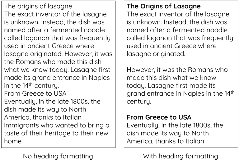
To put it very simply, every webpage should have one main (H1) heading, and text should be broken up into subsequent headings (H2, H3 etc) and paragraph text (P). If you want to learn more about this, have a look at our Easy SEO with Harry Potter series. These text markups usually have a visual effect (headings are usually in bigger sizes, potentially in a different font or design like being bolded), but they also help search engines as well as screen readers understand how to digest what a webpage is about. Consider the below:


Both images contain the same text, but the second image is much easier to read and digest due to the break-up and formatting of the text, whether it's the line breaks or the different formatting of the headings. This is the same for search engines and users using screen readers, as the code of the headings (H1, H2 etc) tell the crawlers and screen readers how to break down the texts and understand the content for the end user.
There are plenty more SEO best practices that a good website should have, and if you want to learn more, read our KISS guide to SEO. Your website designer doesn't need to be an SEO expert, but they should be able to implement basic SEO practices like those listed above. In addition, a lot of SEO practices have big implications for a website's accessibility as well as visual design, so if your website designer isn't implementing the basic SEO practices, that's another big red flag as it can impact your website's findability as well as accessibility.
#3: Consistent Formatting
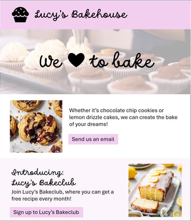
One thing that is often overlooked or underrated is the importance of consistency and formatting. A good web designer should have some form of a style sheet ready, whereby they have the fonts they plan to use, a colour palette that reflects your brand's identity, some form of mood board and so on. Why? Because this helps to establish consistency in the design. A website often contains multiple pages, so sometimes it's easy to lose track of the exact shade of blue that your brand should be using, or what size your body text should be. Consider the below examples:


The content of the two webpages are close to identical, but the first has inconsistent formatting: the fonts are all different, the colours are inconsistent, and the width of the content is varied, with some sections taking up 100% of the width of the page and others taking up 50%. On the other hand, the second uses the same fonts (one for headings and one for body text), the colours are shades of the same pink, and the width of all sections takes up close to 100% of the screen.
On the surface, this may seem like merely an aesthetic difference. However, consistency in design and formatting is synonymous with professionalism and trustworthiness. If your website has inconsistent formatting, it can cause users to become suspicious of your business, especially in the face of increased online scams and fraud.
Not All Web Designers Are Created Equal!
In our eyes, the above 3 requirements are the minimum standard that every web designer should adhere to. However, this is very often not the case. Why? Because many web designers only focus on the aesthetics, without taking into consideration accessibility requirements, SEO settings or consistency.
And unfortunately, even more web designers take advantage of the fact that small business owners don't have the digital confidence to make their own website, so they do the bare minimum in terms of design and execution, knowing their clients don't know enough to push back.
That's why, at Mpowering Solutions, we are dedicated to small businesses, and we promise to ensure the website design for each and every one of our clients comprises of the 3 fundamental basics, so their websites are the best version they can be, at a small business-friendly, affordable price.
If you are looking for a new website, have a look at our Website Design service, and get in touch and see how we can help make your website the best it can be.
Get in Touch
Ready to talk? Simply curious? Send us a message and we'll get back to you to start your digital and eCommerce journey
Privacy Policy | Terms and Conditions
© 2026 Mpowering Solutions
