
The Health Unit
Michele Li-Fay
Background
Dan Manlow has always been a fitness fiend. Having played and coached tennis at the highest competitive level and a keen sportsman in general, he decided to launch his own business, The Health Unit, as a fitness and nutrition coach. He clearly had the expertise and knowledge to help clients lead a better lifestyle, but needed help to get his website set up while he completed his qualifications.
We scheduled a discovery call with Dan to understand his business vision and website desire. He was very clear on what he wanted: a simple, straightforward website that was vibrant, colourful and active that showcased his different packages and services. In addition, he wanted to ensure he could edit and update going forward, so did not require a custom coded website; just an easy-to-use website on an easy-to-use platform.
Brief
Create new website
No or little custom code to allow for easy future updates
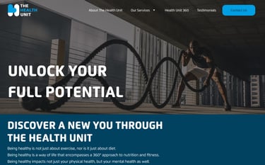
Dynamic design to convey message of activeness and health


The Result
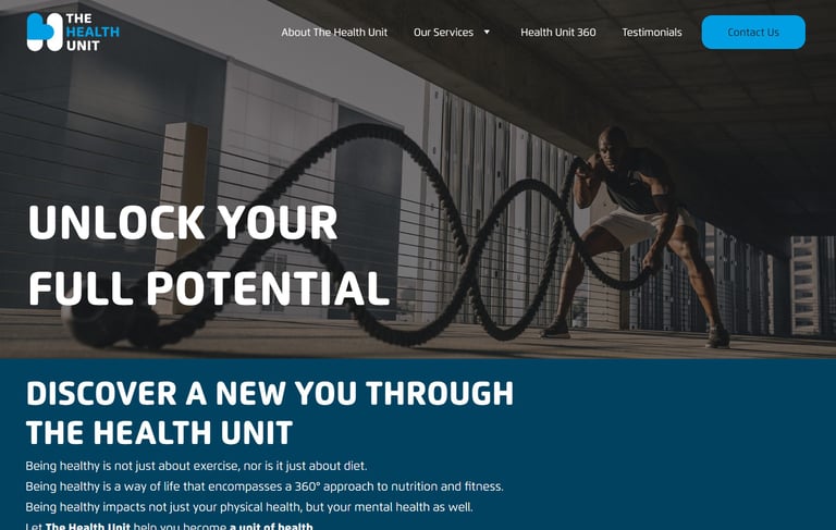
We designed a brand new website for The Health Unit, taking their existing colour scheme into consideration and using dynamic imagery and tone of voice to convey the healthy and fit brand identity of Dan and his business.
Google SEO Score
Highest score of 100
Source: Google PageSpeed
Design
Fit, active and trustworthy
Time Taken
3 weeks

Platform
Hostinger
The Process
Starting a website from scratch meant a lot of decisions made, but here are a few implementations to create the perfect website for The Health Unit.

#1 SEO Copywriting
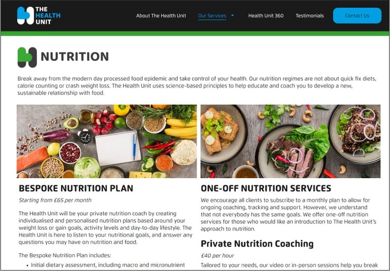
We asked Dan to fill out a website questionnaire to explain the business, The Health Unit's different fitness and nutrition packages, and all key information clients would be interested in. We then turned the casual phrases into detailed, professional copy with SEO keywords to ensure the website hits key search queries to improve visibility, as well as providing relevant information that clients need. We broke the copy down into long-form and short-form, to suit their location and use cases on the website.
#2 Accessibility Checks
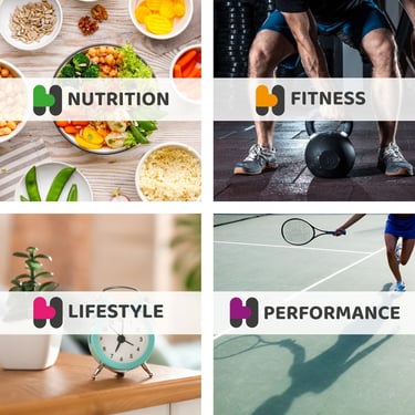
When Dan approached us, he already had his logos designed, which included different colours for The Health Unit's different pillars of service. Dan was very clear that he wanted the website to incorporate the colours, though he wasn't sure how.
No problem; we totally agreed that the colours added a pop of vibrancy and was super dynamic, just like The Health Unit. But before we designed the website, we checked each colour against WCAG guidelines, so we knew how we could incorporate the colours into the design. This means all users, regardless of visual impairments such as colour-blindness, would be able to process the information on the website without hindrance.
#3 Imagery Sourcing
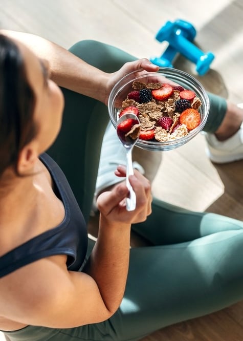
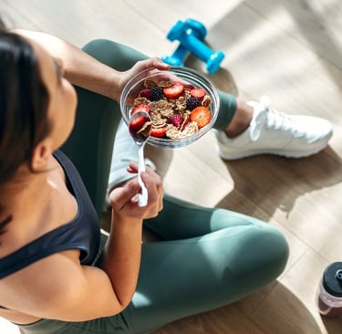
As an energetic fitness and nutrition business, Dan wanted to ensure the imagery onsite was exciting and enticing. So we sourced the relevant imagery with absolute focus and precision: we wanted gym imagery that wasn't intimidating or intense; we searched for healthy food photos that were colourful and balanced instead of bland and boring. The result? A vibrant moodboard of fitness and health while remaining approachable and welcoming, even for fitness newbies.


#4 Logo Creation
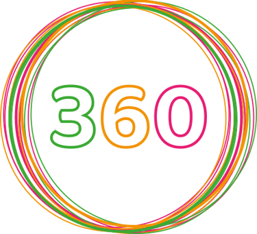
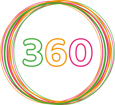
Dan already had his The Health Unit logos created when we started working together, but one logo he didn't have that we thought could be a useful addition was a logo for his top-tier service, Health Unit 360. We incorporated the 4 core colours to signify that Health Unit 360 incorporates aspects of all 4 pillars of service. Even though logo creation is normally an additional service, we felt we had enough of a base design that we could just enhance his logo suite with this 360 logo.
#5 Asset Creation
In addition to the Health Unit 360 logo, we created visual buttons for each pillar of service, as the human brain processes images up to 60,000 faster than words. We sourced relevant imagery to represent each pillar of service, so visitors and clients can quickly understand and process what services The Health Unit provides. We added a semi-transparent white banner to allow for better readability, which benefits all users.
Each button is linked to the relevant website section detailing what the service package entails, so it makes navigating the website easier as well.
Michele designed the website for my new business and did an unbelievable job. I chose her because I knew she would be brilliant, but she still exceeded my expectations! She worked fast and to a very high level and her communication was spot on from the beginning. Couldn’t be happier with my decision to choose Mpowering Solutions and will certainly trust them for future projects!
- Dan Manlow, Founder -
★★★★★
Click below to see more examples of how Mpowering Solutions has helped small businesses realise their website and business dreams.
Need a new web site?
Ready to discuss your digital vision? Send us a message and see how we can help you realise your business's digital potential.
Privacy Policy | Terms and Conditions
© 2026 Mpowering Solutions