The Importance of Inclusive Packaging
The launch of Boots' latest skincare range Good Intent highlights how much work retail has to do in the space of inclusive packaging.
Michele Li-Fay
9/30/20254 min read
Last week while scrolling on LinkedIn, we came across a post announcing the launch of the new Boots No7 Good Intent skincare range. And immediately we were struck with two thoughts back-to-back:
"Wow, the packaging's minimalist look definitely gets the message of clean, good skincare across!"
"Whoa, the words are pretty hard to read."
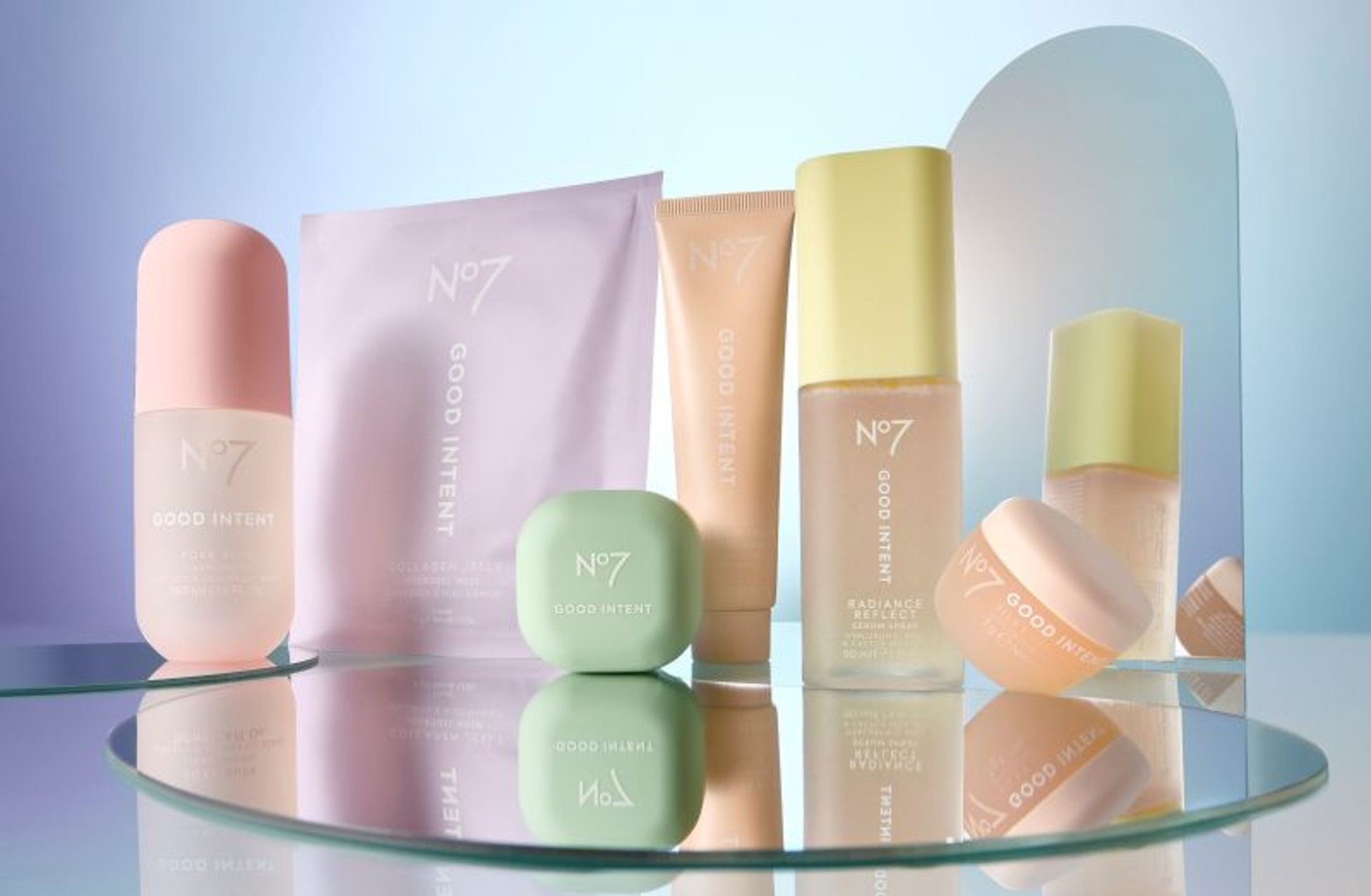
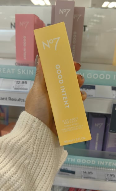
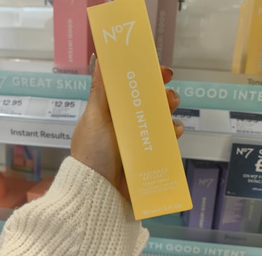
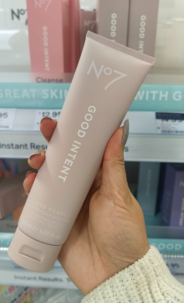
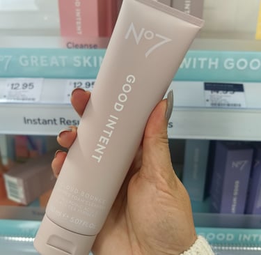
Don't believe us? To be honest, us neither. So we went to a Boots store ourselves to see the products with our own eyes. We have loaded 2 photos with no editing or filters alongside the marketing launch photo; have a look yourself:
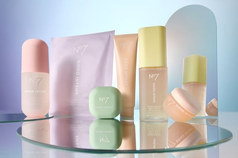
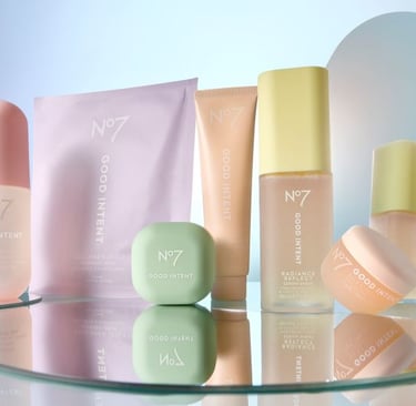
Don't get us wrong. The design, aesthetic-first girlie in us loves the minimalist approach and the pastel shades of colour on the packaging. These products look amazing in the line-up, on the shelves and in your bathroom, so there is a very big part of us that really loves the design.
But this is our opinion as able-sighted consumers, who can squint and just about decipher the white text on the pale pink or lavender background. When it comes to shoppers who have poor eyesight, visual impairments or colour blindness, the text on the packaging is much harder to decipher.
In fact, research published by the House of Commons shows that 90% of disabled consumers currently face accessibility issues when shopping. RNIB cites that 9 out of 10 people with sight loss find information on packaging such as ingredients, allergens and nutritional value difficult or impossible to read, due to the fact that this information is commonly in small, fine text, or uses colours with insufficient contrast.
The topic of inclusive packaging first came onto our radar a few weeks ago, when Strongbow announced its addition of a NaviLens QR code to its packaging in order to help blind and partially sighted shoppers find and understand the product. They collaborated with marketing agency Purple Goat, and gathered feedback from creators and community advocates such as Lucy Edwards, Yahya Pandor, Claire Sisk and Sylvia Chengo, to get real-life insight from real-life experiences.
The quote that really struck us was from Strongbow's brand director Rachel Holms, who said "Hearing directly from blind and visually impaired creators helped us see the gaps we hadn't considered, and that input has shaped something far more meaningful. It's a clear reminder that inclusive design isn't optional; it's essential.", because this is so true. As able-sighted users and consumers, we take so much for granted. Poor colour contrast and small fonts are an inconvenience but not a hindrance, whereas for some, it could literally be the barrier to access, whether it's to learn more, to purchase or to utilise. The luxury we have to shrug and ignore accessibility gaps is not a luxury afforded to everyone, and as a society, we should strive to make the world a more accessible, inclusive place where everyone can live the same (or as similar) experience.
That is why at Mpowering Solutions, we are passionate about making the digital world such as websites more accessible to all, especially those with visual impairments. In fact, we have completed a course in WCAG (Web Content Accessible Guidelines) to stay informed on the latest accessibility requirements and why they matter. We even created a KISS guide on WCAG for those interested in understanding why web accessibility benefits everyone, not just those who need extra assistance.
But our passion for inclusivity extends beyond just digital. Many practices and guidelines within WCAG are most certainly applicable to real-life scenarios, with colour contrast and text size being the most obvious ones. Which brings us back to the Boots Good Intent packaging. For a consumer with no visual impairments? Beautifully clean and minimalist. Sure, it may require a little bit of squinting, but it's lovely. For a consumer with colour blindness or a visual impairment? Pretty difficult to decipher.
It may feel like aesthetic is the antithesis to practicality and accessibility, but we truly believe that, if there is a will, there is most certainly a way. So what would the tweak be (other than any QR code inclusion)? Changing the font weight ever so slightly, using darker text instead of white to give it sufficient contrast to the pastel background. You may lose a little on the pastel, barely-there aesthetic to reflect the clean skincare message, but everyone will benefit from being able to actually understand what has gone into the skincare. And for a range like Good Intent, surely that is the most important factor.
Ready for your new web site?
Want to join us in our mission to make the digital world more inclusive? Get in touch today to learn more about website design services and how we can help you launch your digital identity today.

Privacy Policy | Terms and Conditions
© 2026 Mpowering Solutions